App Store Product Page Header: How to Use Apple's New iOS 27 Creative Asset
The new App Store Product Page Header gives apps a major image or video placement above the rest of the listing. Here is how to use it for ASO, conversion and Apple Ads
The App Store product page is getting a new piece of real estate that app marketers should not waste.
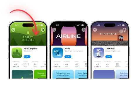
With iOS 27 and iPadOS 27, Apple is introducing a Product Page Header that can use an image or video at the top of an app's product page.
Apple describes it as the first thing people notice when they land on the page.
That alone makes it important.
For years, most App Store creative optimization has meant improving the icon, screenshot sequence, app preview, and metadata. The new Product Page Header adds another visual decision before the user gets deep into the listing.
If you are serious about ASO, this is now part of conversion optimization.
What Is the App Store Product Page Header?
The Product Page Header is a new App Store Creative Asset that can appear at the top of your app or game's product page on iOS 27 and iPadOS 27 and later.
Unlike a normal screenshot, the header is not limited to showing the app interface in the same way screenshots and app previews traditionally do.
Apple says the header can be used to express:
- Your brand.
- Seasonal offerings.
- New content.
- Major moments or campaigns.
- The overall tone of the app or game.
In other words, Apple is giving developers a more traditional marketing canvas inside the App Store.
That is a meaningful change.
Why the Product Page Header Matters for ASO
ASO gets reduced to keyword rankings too often.
Rankings matter, obviously. But ranking only gets the user near your product.
The listing still has to close the install.
The new Product Page Header sits directly inside that conversion step.
A good header can immediately answer one of the most important questions in app marketing:
Why should I care about this app?
A bad header can do the opposite.
It can introduce clutter, repeat information already visible in the screenshots, or make the listing look like a generic banner ad.
Apple's own best-practice guidance tells developers to focus on one clear idea and design with a first-time visitor in mind.
I would take that literally.
If your header needs five messages to work, you do not have a header problem. You have a positioning problem.
What Should You Put in an App Store Product Page Header?
The strongest concept depends on why people download your app.
I would start with one of four approaches.
1. The core outcome
Show the transformation the user wants.
For a strength app, that might be progress and getting stronger.
For a language app, it might be speaking confidently.
For a photo privacy app, it might be protecting personal photos.
The image or video should make that outcome obvious without requiring the user to study the rest of the page.
2. The product experience
Some apps sell best when people can immediately see the interface or gameplay.
If your product has a genuinely distinctive visual experience, use it.
Do not bury the most desirable part of the app on screenshot number six.
3. The brand
Strong consumer apps and games may benefit from a more brand-led header.
This is especially useful when brand recognition itself reduces uncertainty.
But "brand-led" does not mean adding a giant logo and calling it finished.
The creative still needs to create desire.
4. Seasonal or new content
Apple specifically calls out seasonal offerings and new content as possible uses.
This is useful for games, entertainment apps, shopping apps, fitness apps, and any product with recurring campaigns.
A New Year's fitness push, a summer travel campaign, a game season, or a major content launch can now influence the top of the App Store product page.
Do Not Turn the Header Into a Feature List
This will probably be the most common mistake.
The new space appears, marketing sees empty pixels, and suddenly every stakeholder wants a message inside it.
"Can we add the award?"
"Can we mention AI?"
"Can we add three features?"
"Can we put a CTA?"
"Can legal add a disclaimer?"
Then the header becomes visual soup.
Apple explicitly warns that dense or cluttered assets dilute impact.
The better approach is one concept per asset.
If you want to test three messages, make three assets and test them. Do not combine all three into one compromise.
Product Page Header and Product Page Optimization
This is where the feature gets more interesting.
Apple says you can use Product Page Optimization to test alternative Product Page Header visuals.
That means the header does not have to be a subjective brand decision.
You can treat it like a conversion experiment.
For example, a meditation app could test:
- Header A: Better sleep.
- Header B: Reduce stress.
- Header C: Build a daily meditation habit.
A workout app could test:
- Header A: Get stronger.
- Header B: Never guess your workout again.
- Header C: Track every lift and beat your previous numbers.
Those are real message tests.
Changing one background color is not a strategy.
The point of Product Page Optimization should be to learn which promise makes more people want the app.
Use a Universal Creative Asset When It Makes Sense
Apple says developers can use a universal creative asset for both the Product Page Header and Search Results asset.
This can simplify production and strengthen brand recognition across the App Store.
There is a strong acquisition logic here.
A user sees your visual in search, taps the app, and then sees a related visual at the top of the product page. The message continues instead of resetting.
That consistency can be useful.
But I would not assume universal is always best.
Search and product-page visitors are at different moments.
In search, you may need to be extremely obvious about what the app does.
On the product page, you may have more room to build emotion or brand.
Test both approaches.
For a deeper look at the other placement, read my guide to the new App Store Search Results Creative Asset.
Product Page Headers and Custom Product Pages
Apple is also connecting Creative Assets to Custom Product Pages.
That creates a much more interesting paid-acquisition workflow.
Instead of one generic header for every user, you can build different product experiences around different acquisition messages.
Imagine a photo app with three paid campaigns:
- AI photo enhancement.
- Background removal.
- Professional headshots.
Those users have different intent.
Sending all of them to the same generic product page throws away information you already paid to acquire.
A better system is to align the ad, Custom Product Page, header, and screenshots around the same promise.
That is especially relevant for Apple Ads, where Apple is expanding creative control across App Store placements.
The Header Is Not a Direct Ranking Hack
I would not describe the Product Page Header as a direct App Store ranking factor because Apple has not announced that.
Uploading one does not magically move you from position 12 to position 3 for a keyword.
The real value is conversion.
If you already receive organic or paid traffic, a stronger first impression can help more of that traffic become downloads.
That is ASO too.
The apps that win are not always the apps with the most metadata tricks. They are often the apps that make the right user understand the value faster.
The header gives you one more place to do that.
Product Page Header Best Practices From Apple
Apple's current guidance can be summarized into a few useful rules:
- One idea: Avoid dense or cluttered compositions.
- Think like a new user: Design for someone who knows nothing about the app.
- Keep key elements legible: Assets can appear in different contexts and sizes.
- Use a clear focal point: Keep important artwork away from areas that may be cropped.
- Keep text short: If you use copy, it should enhance the visual rather than explain everything.
- Localize when needed: Do not assume one English-language asset works everywhere.
- Follow App Store content policies: Creative Assets still go through App Review.
Apple also says App Store creative content must meet its requirements for broad audiences, even when the app itself has a higher age rating.
So do not treat this like an unrestricted Meta ad creative.
How I Would Test Product Page Headers
I would build the first testing roadmap around message angles, not decorative variations.
A simple structure:
Control: Your current product page experience without overcomplicating the message.
Variant 1: Core functional promise.
Variant 2: Strongest emotional outcome.
Variant 3: Brand or social-proof-led idea, where appropriate and compliant.
Then review the result with the same discipline you would apply to any conversion experiment.
Do not declare a winner because one version "looks premium."
Let user behavior decide.
And when a message wins, do not stop at the header. Carry that learning into screenshots, Custom Product Pages, Apple Ads, onboarding, and even external paid social creative.
Good App Store testing should improve the whole acquisition system.
Prepare Before iOS 27 Rolls Out Publicly
Apple currently says the new App Store marketing capabilities are coming this fall.
As of August 7, 2026, that means teams still have time to prepare instead of scrambling after launch.
I would do four things now:
- Identify the strongest app value proposition.
- Create two or three genuinely different header concepts.
- Prepare localized versions for your largest markets.
- Decide what you want to learn with Product Page Optimization.
Apple has published design templates for the new assets in Figma, Photoshop, and Pixelmator through its App Store asset best-practices resources.
Use them.
There is no reason to guess the layout.
The Takeaway
The App Store Product Page Header gives app marketers a new first impression to optimize.
That is the opportunity.
Do not use it because Apple added a new field in App Store Connect.
Use it because the first seconds on a product page determine whether someone keeps exploring or leaves.
Your competitors will get the same placement.
The advantage will not come from having a header.
It will come from having a better message in the header.
For the full iOS 27 update, including Search Results assets, Asset Library, ASO implications, and Apple Ads, read Apple Adds New App Store Creative Assets for iOS 27.
Sources
Free starter guide
Ship your first Apple Ads campaign in 2 hours.
Most guides make Apple Search Ads sound like a project. It's not. This is the exact setup I use with every new client: campaign structure, keyword match types, starting budget. Two hours, start to finish, no agency jargon.
One email. Unsubscribe anytime.
Keep reading
Apple Maps Ads: What Marketers Need to Know
Learn how Apple Maps Ads work, where they appear, how businesses can use them, and why search intent makes this advertising channel worth understanding
How to Advertise on Apple Maps: Complete Apple Maps Ads Guide
A practical guide to setting up Apple Maps Ads, choosing locations, adding creative, setting a budget, and preparing your Apple Business listing before you spend money
App Store Search Results Creative Asset: How to Win More Installs in iOS 27
Apple is adding custom image and video assets to App Store search results. Here is why this matters for ASO, Apple Ads, and competing for high-intent searches
Apple Adds New App Store Creative Assets for iOS 27: Product Page Headers and Search Results
Apple is adding new image and video placements to App Store product pages and search results. Here is what app marketers should prepare before iOS 27 rolls out